
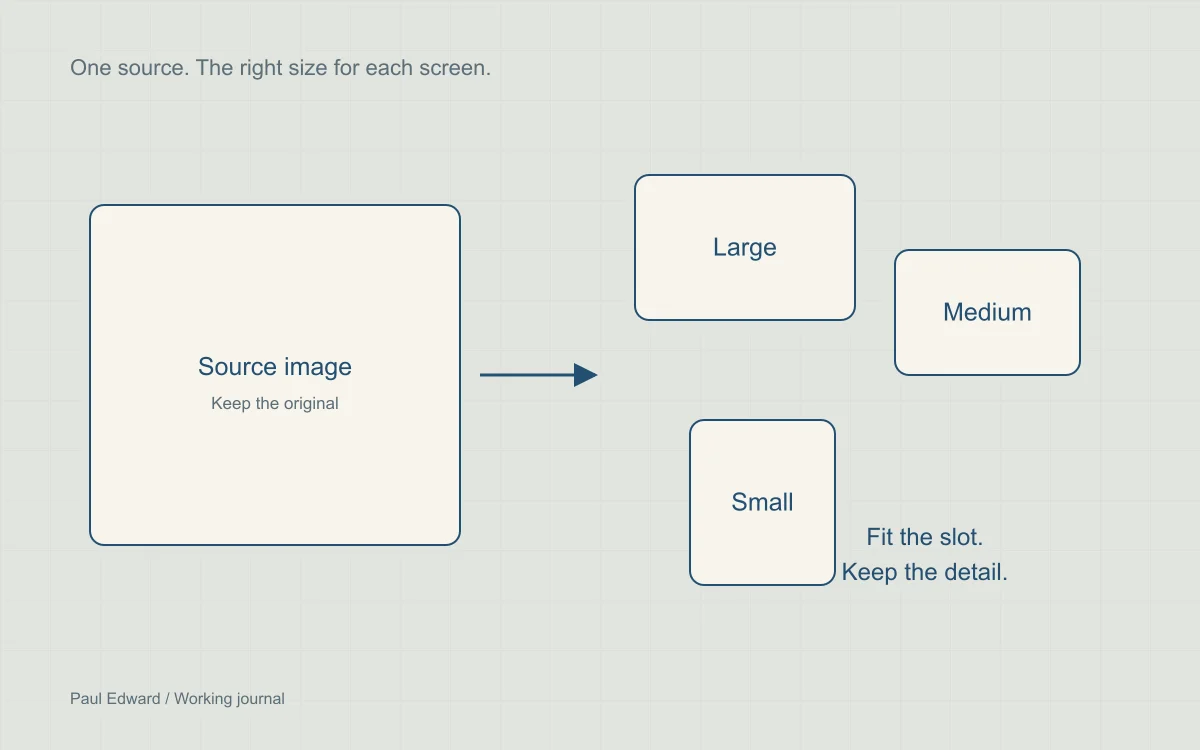
Start with the image the reader actually sees
Inspect rendered dimensions, the selected resource, transferred bytes and the image’s role in the page. A diagram with small labels needs a different treatment from a photograph. A large source file does not need to be delivered unchanged to every visitor.
Identify the actual Largest Contentful Paint element in a trace. It may be text rather than an image. Optimizing a below-the-fold thumbnail will not fix an unrelated render-blocking stylesheet.
Choose format and quality per asset
Compare AVIF and WebP with your existing JPEG or PNG at the sizes people will use. Check edges, gradients, skin tones, transparency and text. File-size savings depend on content and encoder settings; a universal percentage is not a useful quality target.
Use SVG for suitable diagrams and icons so labels and lines stay sharp, while retaining a raster version for sharing platforms where needed. Essential explanation should also appear in HTML. Do not call a lossy image lossless because it achieves a high perceptual similarity score.
Write responsive markup that matches the layout
The following example assumes a full-width image inside a 48rem content column with 1rem gutters on small screens. Adjust sizes to your actual layout. The browser uses candidate widths, the slot size and device conditions to choose a resource.
<picture>
  <source type="image/avif"
    srcset="/media/diagram-480.avif 480w,
            /media/diagram-960.avif 960w,
            /media/diagram-1440.avif 1440w"
    sizes="(max-width: 50rem) calc(100vw - 2rem), 48rem">
  <img src="/media/diagram-960.webp"
    srcset="/media/diagram-480.webp 480w,
            /media/diagram-960.webp 960w,
            /media/diagram-1440.webp 1440w"
    sizes="(max-width: 50rem) calc(100vw - 2rem), 48rem"
    width="1440" height="900"
    loading="eager" fetchpriority="high" decoding="async"
    alt="Public requests pass through a cache before the origin">
</picture>
For an off-screen supporting image, use lazy loading and ordinary fetch priority instead. Width and height reserve the aspect ratio; CSS can still make the image fluid. Keep the variants at the same aspect ratio unless you are intentionally using art direction.
Use the WordPress image pipeline where possible
For Media Library images, use WordPress attachment-image helpers so available sizes and responsive attributes can be generated from attachment metadata. Verify the output: custom markup or missing derivatives can bypass those benefits. Theme illustrations can use an explicit, versioned set of sizes.
Alternative text should convey the information the image adds. Decorative repetitions of the adjacent heading can use an empty alt attribute. Do not turn alt text into a list of target keywords.
Validate delivery and cache behavior
- Check selected image URLs on narrow and wide screens, including higher pixel densities.
- Ensure the primary image is discoverable without waiting for JavaScript.
- Check image quality at its actual display size, not only at a small preview.
- Confirm off-screen media does not dominate the initial transfer.
- If a CDN negotiates formats, verify cache keys distinguish the responses correctly.
- Version changed files or purge relevant caches so readers receive the update.
Frequently asked questions
Do you need an image CDN?
A CDN with transformations can simplify a large, frequently changing media library. A small journal may be served well by a few generated variants and ordinary static caching. Compare ongoing cost, operational complexity and actual transfer savings before adding another service.
Should the main hero image use lazy loading?
Usually not when it is visible immediately or is the page’s LCP element. Make its URL discoverable in the initial HTML, provide suitable responsive candidates and consider high fetch priority selectively. Lazy-load supporting images that begin below the initial viewport.
Is AVIF always better than WebP?
No single format and quality setting wins for every image. Compare output size and visual quality on the actual asset, including fine labels, gradients and transparency. Retain an appropriate fallback and verify the file the browser selects.
Why do images need width and height if the layout is responsive?
Those attributes establish an intrinsic aspect ratio so the browser can reserve space before the image arrives. CSS can still make it fluid. Use correct dimensions and responsive sources, then check the real layout for shifts. The WordPress speed guide places image delivery in the wider performance workflow.
Sources and further reading
Keep exploring
Continue with Core Web Vitals diagnosis or the complete performance checklist.


Leave a Reply